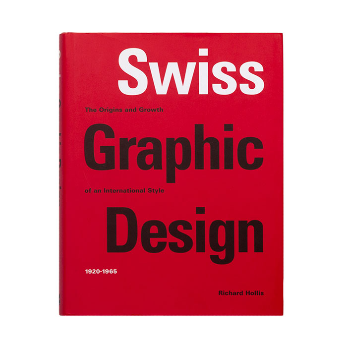
Swiss graphic design. The origins and growth of an international style 1920-1965
Richard Hollis
Used book in a very good condition.
Note from the editor:
This book gives the first comprehensive account of the development of the ‘Swiss’ style. Originating in Russia, Germany, and The Netherlands in the 1920s, stimulated by the artistic avant-garde and alongside the International Style in architecture, Modernist graphic design and typography found a firm foothold in Switzerland before and after the Second World War.
By the 1950s, Switzerland had developed a uniquely clear graphic language, which matched the country’s reputation for efficiency and precision. Evident not just in posters but in advertisements, brochures and books, ‘Neue Grafik’ or ‘Swiss’ style, as it became known, was respected internationally for its formal discipline: simple methods that could make poster dramatic and give an order and elegance to typographic design. Sharing the disciplines of Swiss Concrete art, designers organized images and text into geometrical grids. With sans-serif typefaces such as Helvetica and Universe, these were chief components of the Swiss style which spread across the world. Its influence is still seen today, recognizable in corporate publicity and highway signs from Amsterdam to Tokyo and from London to Los Angeles.
Illustrated with over 700 images ‒many of them unfamiliar‒ this book sets out the chief characteristics of Swiss graphic design and explain why it looks as it does. Richar Hollis gives a rich and fascinating account of this key period in graphic design history, setting the stylistic developments into the social and cultural context of the times.
/informations
| Poids | 1.650 kg |
|---|
CHF 70.00
/commande
L’article que vous recherchez n’est pas dans notre assortiment? Notre équipe le commandera volontiers pour vous.


